Dublin had quite the surprise for me on my walk home from work yesterday evening. As I walked along Talbot Street I passed the entrance to the Irish Life Mall. I hadn't been through it in years so thought I'd take a little detour.
Oisín Kelly’s Chariot of Life sculpture in the front forecourt, facing Abbey Street
My first thought was how dated the mall's interior looked...but what great potential it has, if shown a bit of love to drag it, kicking and screaming, out of its flares and into 21st century skinny jeans.
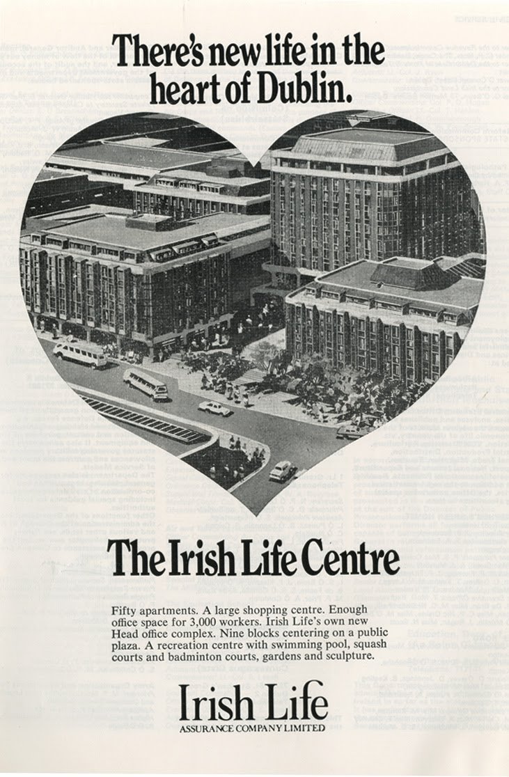
Advert for the planned Irish Life Centre from 1977 - found in Brand New Retro
Entrance from the East (Gardiner Street)
Designed by one of Ireland’s most important modernist architects, Andy Devane, it was the first major mixed-use development in Dublin City, and has been the HQ of Irish Life since the building’s completion in 1980.
Secondary entrance plaza off Abbey Street
As I rambled through the centre I came across a set of steps that I hadn't noticed before. Not being in a rush, I thought I'd have a look. As I walked up the steps I was surprised to find a fountain come into view. The space opened up to a generous, planted courtyard space.
Courtyard space, with Liberty Hall in the background
Covered pathways meander through the space, with offices at courtyard level and a mix of offices and apartments over.
Courtyard
There's a generousity to this space; ample planting, the background sound of water, small spots to stop and sit for a chat...exactly what a public space should be.
It's dated, sure...it kind of reminded me a bit of some set from Star Trek, the original series. That aside, it is a strong example of late 1970s thinking on density, permeability and inner-city multi-purpose usage; the site achieved considerable density, but not at the cost of quality public open space.
Oisín Kelly’s Chariot of Life sculpture in the front forecourt, with the Custom's House in the background
I'm old enough to remember the late 70's and early 80's...I have fond memories of Angel Delight desserts, SPAM and Big Daddy vs Giant Haystacks.
Not everything from back then was awful though; today's architects and planners could learn a thing or two from this development.
I might start a trend; platform shoes & skinny jeans. Take that ye Fashionista police...


